Nicholas Pappagallo Jr is a photographer originally from New Jersey, now residing in Arizona. He was on a mission to optimize a website and photography club he runs called the Photographer’s Adventure Club. The website, blog and event section was to be transformed into a branded design.
In this case study, you will see what was happening in the original website, what the goals were for the new website and how the Photocrati theme filled the gap that Nicholas needed.
Original Website
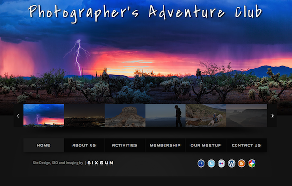
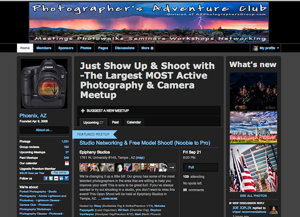
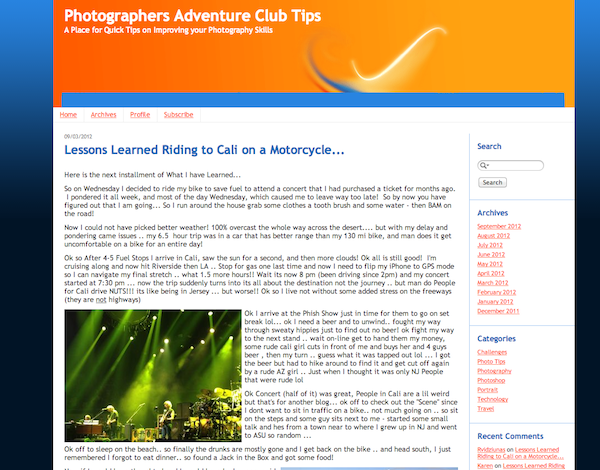
The original Photographer’s Adventure Club website is a custom-built site from one of the club members. For a blog, TypePad was being used. It worked, but unfortunately did not match the look of the main website. The meetup page is a separate event calendar, using the Meetup system and also did not match or fit with the main site.
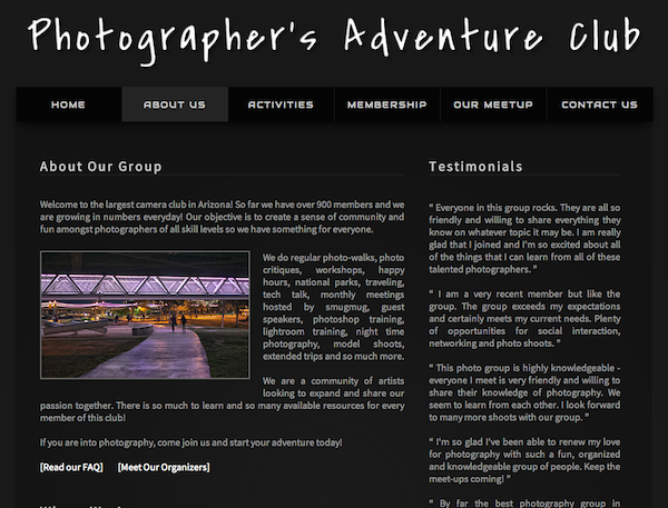
As you can see, the main website is big and beautiful, showing off some beautiful photographs. Clicking on the “About Us” page (below) brings a two-column style page with clean typography and a gray color scheme, drawing your attention to the content and photograph.
The Meetup page, while keeping with the color scheme, did not flow with the main site. The typography was different and the layout was not similar in any way.
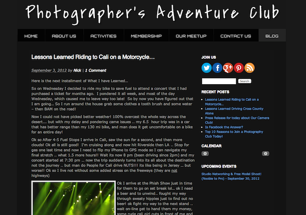
The TypePad blog for the club did not match the color scheme or layout as well. But that was going to change with the redesign.
Picking A WordPress Theme
The most important features for picking a WordPress photography theme
- Clean looking
- Easy to use
- Easy to customize
- Professional
- Match current website theme
The goal(s) of the website redesign
To have easier to navigate site – currently everything was separate, website, blog & calendar … now they will all be in one place and a better user interface than before!
New Website
When deciding on a theme, Nicholas researched possible WordPress photography themes and came to a decision, picking the Photocrati theme for the new blog. After installing the theme, some customization needed to be done in order to match the width, color scheme and unique menu structure of the main site.
The Photocrati support team was happy to lend a hand and after some theme option changes, custom CSS and adding the club’s logo, the blog looks very similar to the main site.
WordPress has a TypePad importer that made the transition of blog articles very easy. The tool doesn’t import images, so those had to be done manually.
The only thing left was to tackle the events section, in order to replace Meetup. After additional research, Nicholas decided on Events+ as the new event management tool and Membership for subscription levels.. Like the Photocrati theme, Events+ was able to be branded to match the look of the main site. The site is also using the NextGEN WordPress gallery plugin to enable galleries for events with the ability for attendees can upload. In addition, BBPress was used to add a community forum to the website.
Conclusion
The Photocrati theme was able to resolve the problems that Nicholas had with his the Photographer’s Adventure Club, mainly the lack of branding between site, blog and events. With a customizable WordPress theme, and two additional plugins to add additional functionality, the new website is complete and live.
It was fun seeing the process from start to finish and we’re happy to share this club with the photography community. Nicholas is slowly converting future events to the new website so check out the site and be a part of some fun events.
Thanks for reading,
Scott


Nicholas Pappagallo Jr.
26 Mar 2013Scott the conversion to Photocrati has been the best thing we have done for the club! Everything matches now and flows! Thank you so much for your assistance in getting everything up and running!