
Although Ezra’s photography is truly magnificent, his website was not to his liking. We spoke with Ezra’s team to see how the Photocrati WordPress theme could help change that.
In this case study, you will see what was happening in the original website, what the goals were for the new website and how the Photocrati theme now shows off Ezra’s amazing photographs as it should.
Original Website
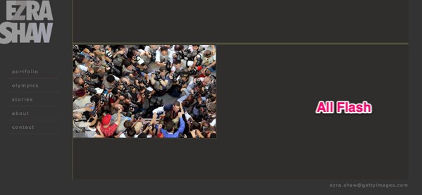
Originally Ezra’s website was flash based, but an increasing amount of its website traffic was coming from iPads and iPhones. In addition, Ezra did not have the ability to manage his own content on the site.
Furthermore, although flash can provide the ability to create amazing animation, it provides very little SEO benefit. In addition, a flash based website has the ability to prohibit a photographer from showing off their photographs with the impact that a portfolio website should.
All these factors led to the decision to seek a new website design.
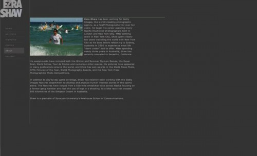
Look at the two screenshots above. Notice the size of the menu compared to the rest of the page? The layout for the portfolio in Ezra’s flash website was awkward and small. The numbers above the photograph should have been thumbnails instead. The play button is nice for the slideshow, but it’s still small. The full screen button does enlarge the photograph, but for some reason, it also opens other pop-up windows. Unfortunately the Olympics and Stories pages worked the same way.
This one is not uncommon for flash websites. Notice all the empty space to the right of Ezra’s biography? That will not exist when Ezra’s website is redesigned.
Picking A WordPress Theme
The most important features for picking a WordPress photography theme
- Bug-free
- Solid customer support
- Ease of use
- Attractive design.
The goal(s) of the website redesign
To present the photographer’s work simply and quickly.
New Website
With Photocrati to the rescue, Ezra was able to clear up both of the problems on his list and fulfill the requirements for a WordPress theme.
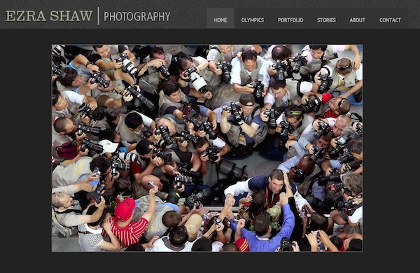
Meet the new home page for Getty Photographer, Ezra Shaw. It has the same color scheme as his original site which helps for branding purposes. But the nameplate is new — in keeping with the new design. The menu is large and at the top where it should be. The main gallery is big, vibrant and best of all, java based. Utilizing java and html instead of flash will let search engines crawl the ALT tagged images, which will increase SEO and traffic.
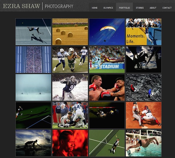
Now Ezra’s portfolio page shows off his stunning photographs as thumbnails instead of numbers. They load fast and can easily be modified and re-arranged thanks to the Photocrati gallery management system.
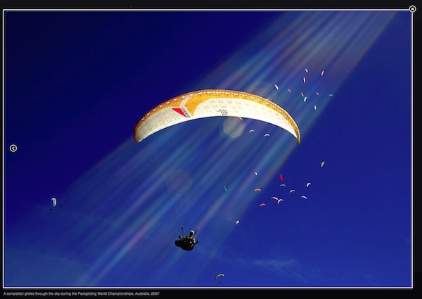
To top it off, a visitor can now click on a thumbnail to bring up a Lightbox/Java driven modal window of the enlarged photograph. This modal feature will also work on iPads and iPhones.
Depending on the size of the uploaded photograph, the Photocrati theme will automatically fit the photo to the browser size. So if an extra-large photograph is uploaded, then an extra-large photograph will display on a big screen. What I mean is, this specific photo takes up the entire screen on my 23″ monitor. That is a big photograph!
How the Photocrati theme helped since launching the new website
Ezra’s father — web developer and designer Kip Shaw — developed the site for Ezra.
“Photocrati has just the right mix of features, control, and options to quickly build a custom website. As a web developer and photographer, I want to help other photographers who might not have the time nor the skill set to build a website, yet do need to have control over content once the website is built. Photocrati is a WordPress theme that does this job well.”
“What a transformation. Getty Photographer, Ezra Shaw, moved to the @Photocrati WordPress theme” Click To Tweet
Conclusion
The Photocrati theme was able to resolve the problems that Ezra Shaw had with his website and also complete his list of requirements for a WordPress photography theme. It is always nice to hear a story of a happy customers, but it’s really fun to experience the decision process and redesign.
Ezra is busy getting ready to go off to the Olympics in London, but if anyone wants to contact Kip to learn more about this project, email him at info(at)clearlight7.com.
Thanks for reading,
Scott



Irene Jones
17 Jul 2012What a great case study — fantastic imagery — and transformation of the site.
Madeline Jutras
24 Jul 2012Such brilliant photography — so it’s nice to see it showcased so nicely with the Photocrati theme.
Martin Tavares
27 Jul 2012Wow … love your new website!
bob
19 Jan 2013Is the full-screen Lightbox feature something that comes with Photocrati, or is it a plug-in?
Scott
19 Jan 2013It’s built in 🙂