As a photographer, your website is a reflection of your work. You can use it to showcase your craft and attract new clients. However, just as important as the photos you use are the type of image gallery you display them in.
Choosing the right image galleries can maximize the effect of your portfolio and influence how visitors perceive both your work and your brand. Strategically selecting displays that work best with your website isn’t a complicated task; it just requires considering a few essential elements.
In this article, we’ll discuss a few types of image galleries and how different displays impact your site. Then we’ll explain three key factors to consider when choosing a gallery style for your photography website. Let’s get started!
How Image Gallery Displays Impact Your Photography Site
The displays you choose for your photography site have an enormous effect on its overall aesthetic. In addition to your portfolio’s appearance, they also influence its User Experience (UX). Galleries that are difficult to navigate or have confusing layouts may reflect poorly on your brand.
It’s a good idea to be selective with the images and galleries you include on your site. While you may have hundreds of photos to showcase, too many images and galleries on a site can be overwhelming. They can also slow your loading times down.
Additionally, having a variety of displays to choose from is helpful. Not all pages serve the same purpose, so being able to use the best gallery for each comes in handy. For example, you may want to use a slideshow on your homepage, but a masonry grid for your portfolio.
Some image gallery types you might consider include:
- Slideshows or sliders: Automatically scroll through a selection of images in a single viewer.
- Filmstrip or manual scroll: Similar to a slideshow, except visitors can scroll through the images themselves by clicking on navigation arrows.
- Blogstyle: Single images placed one after the other down the page.
- Thumbnail: Small images in a grid used for previewing, which can be expanded to examine each photo in detail.
- Masonry tiles or grids: Individual images arranged to fill the page in an organized manner.
Each has its pros and cons, and can either help visitors view your images more easily or make them difficult to decipher.
How to Decide Which Type of Image Gallery to Use on Your Photography Site (3 Key Factors)
To help you decide which type of image gallery to use on your photography site, there are a few key factors to consider. Let’s take a look at three major ones.
1. Select Galleries That Take Up the Right Amount of Page Space
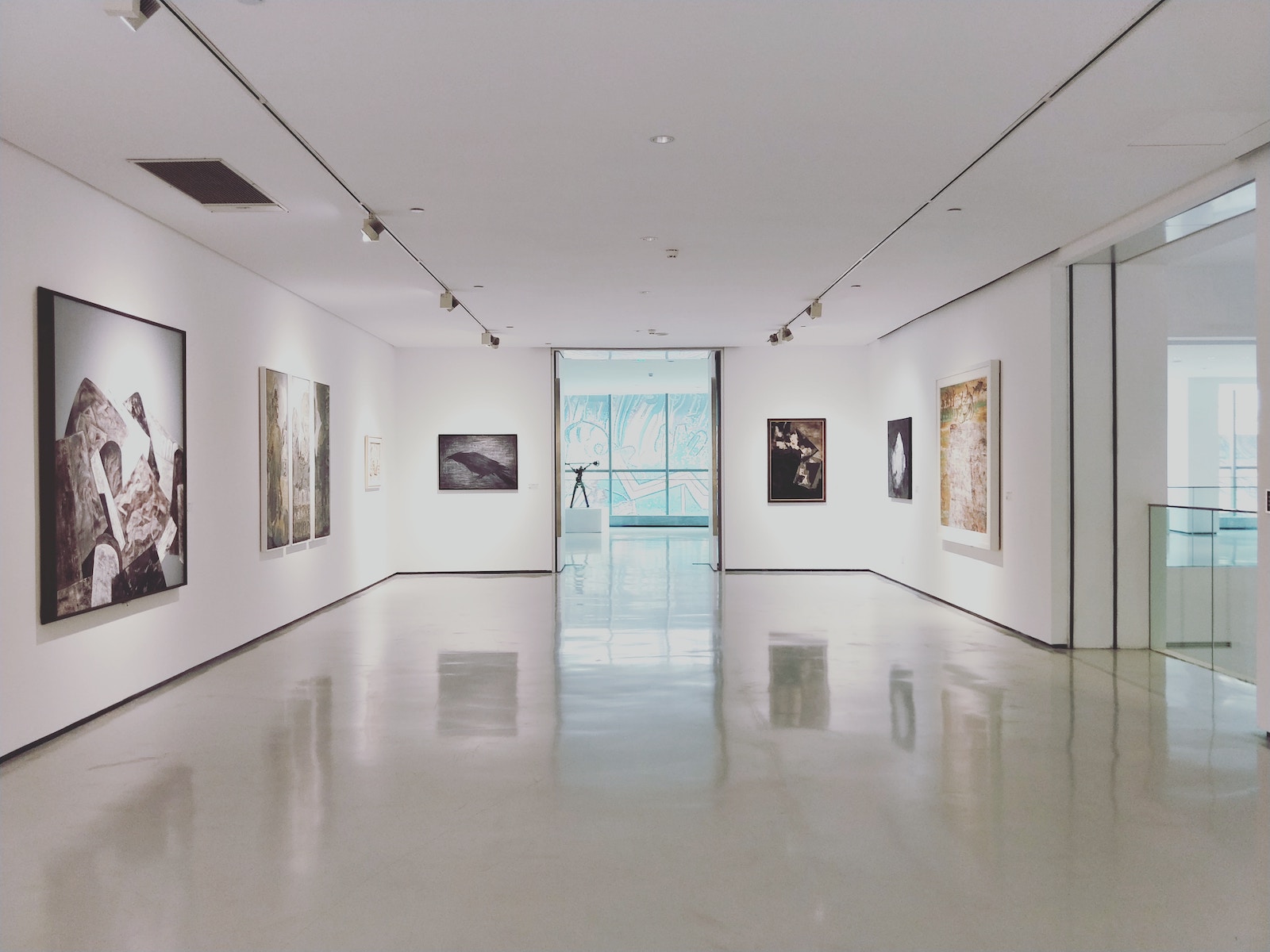
Maximizing and structuring the space on your web pages is essential. Too many images or galleries can make your site look cluttered and messy. An appropriate amount of white space can go a long way to enhance your website’s design:
Another consideration is how much text and other content will be on the page along with your image gallery. If your goal is to get visitors to click through your photos, you don’t want unnecessary elements distracting them or negatively impacting the display.
For parts of your site that already have a significant amount of content – such as your Home or About pages – space-saving sliders or filmstrip galleries can keep them from becoming overwhelming. However, if you want all the attention on your photos, you might use a grid or blogstyle display.
2. Choose Displays That Work for Your Images’ Sizes and Orientations
Another important factor to consider is your images’ sizes and orientations. Some galleries are better suited to certain layouts than others. For example, you probably wouldn’t want to use a slideshow for vertically oriented portraits. They’re better suited to horizontal images.
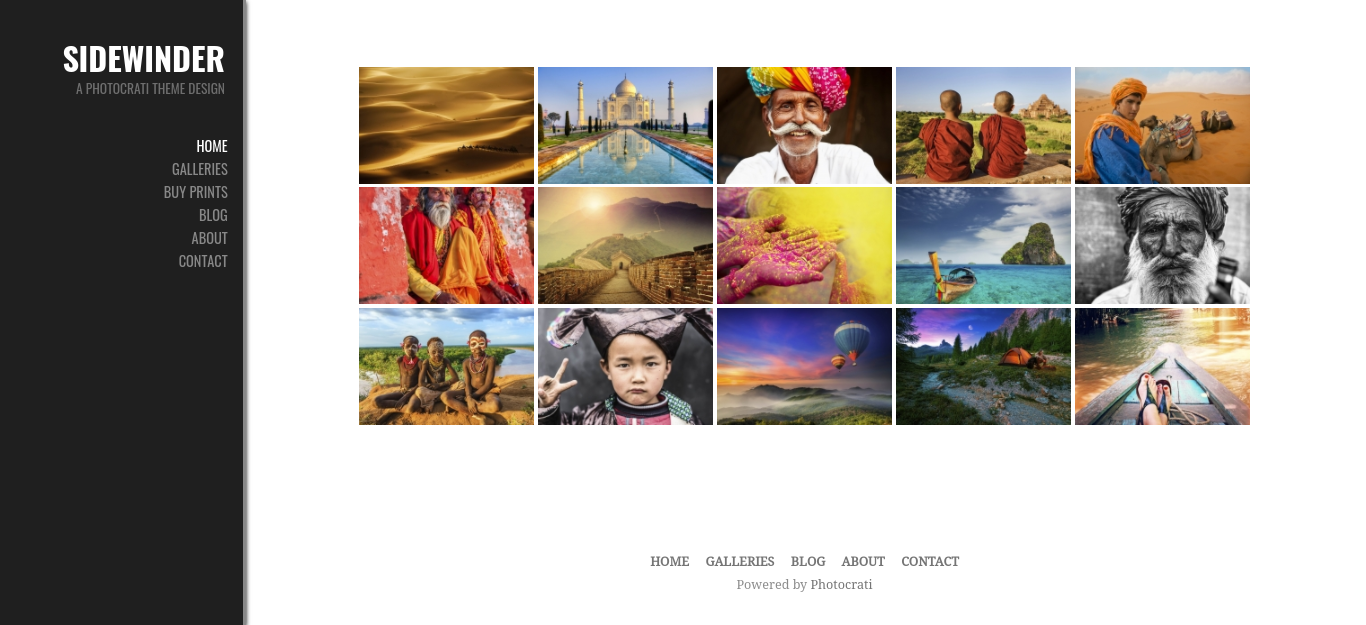
If you’re like most photographers, though, you likely have a mixture of sizes and orientations throughout your portfolio. Masonry tiles are an effective solution since they adapt to fit each photo into an uneven grid:
This is a popular, versatile display. It makes it easy to present a wide range of images in a way that is clean, rather than cluttered.
Keep in mind that not everyone who visits your site will be doing so from a computer. Therefore, it’s a good idea to use responsive galleries to ensure your images display neatly on any device.
3. Consider Your Photography Niche and Its Standards
The type of photography you specialize in can influence which type of image gallery works best for your site, too. For example, if you’re a wedding photographer, you’ll probably want a thumbnail gallery so clients can view all the photos for their big day at once.
On the other hand, if your niche is travel photography, you might want a blogstyle gallery. This enables visitors to focus on one image at a time, and can also lend a narrative feel to your photos.
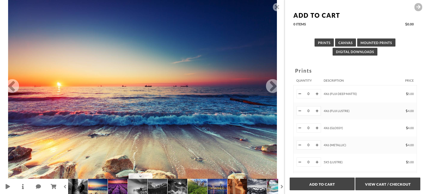
If you sell stock photos, you’ll likely want a gallery that includes a shopping cart button for easy purchasing:
For this, we recommend NextGEN Pro. It’s one of the most popular WordPress plugins for photographers and comes with multiple galleries as well as e-commerce extensions. Fortunately for Photocrati customers, NextGEN Pro is included!
Conclusion
Image galleries present you with the opportunity to display your photos in the most stunning way possible. However, choosing the ones that fit the style and purpose of your website is crucial.
As we discussed in this article, three key factors in choosing an image gallery for your website are:
- Selecting galleries that take up the right amount of page space.
- Choosing displays that work for your images’ sizes and orientations.
- Considering your photography niche and its standards.
Do you have any questions about choosing an image gallery for your photography website? Let us know in the comments section below!


