There is such an overwhelming amount of photography website designs around the Internet. Sometimes in life, we get inspired by the strangest things. In this article you will see how a simple baby toy inspired some insights into photography websites.
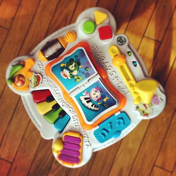
My nephew was playing with this musical toy and certain things the toy did sparked some thoughts.
- Keep your colors consistant – This toy has so much going on with color. Of course, because it’s a baby toy the colors are meant to trigger certain responses. A photography website color scheme should be simple so that the color in the photographs are drawing the viewers eye.
- Music – This toy is meant for a child to hear and play music. My nephew already loves music, so when he plays with the toy he also dances. A photography website can have music, but think about the audience before setting it to auto-play. Will your audience enjoy the music?
- Things to touch – Baby toys have so much to touch. Things move, open, make noise and have texture. A photography website should also have things to touch, but in an organized way. Keep the layout clean and have a focus so your visitors do what you want.
- Durability – Most baby toys, like the one you see in the photo above, are built to last. Make sure you are using a well designed and thought out WordPress photography theme and use the best website hosting for photographers so you’re website is safe.
Now it’s your turn. Think about a toy and comment below with what it teaches you about supercharging your photography websites.
Thanks for reading,
Scott


Stevie
24 Jan 2014Interesting article, Scott.
Although my little one has plenty of toys, none of them seem to spark anything regarding photography. However, I really enjoy your unique angle here. I don’t think I would’ve ever came up with a way to link a baby toy to photography. Really enjoy what you’re doing here, though. I do agree with keeping your website, whether it be photography or otherwise, in a format that has consistent, appealing colors.
-Stevie